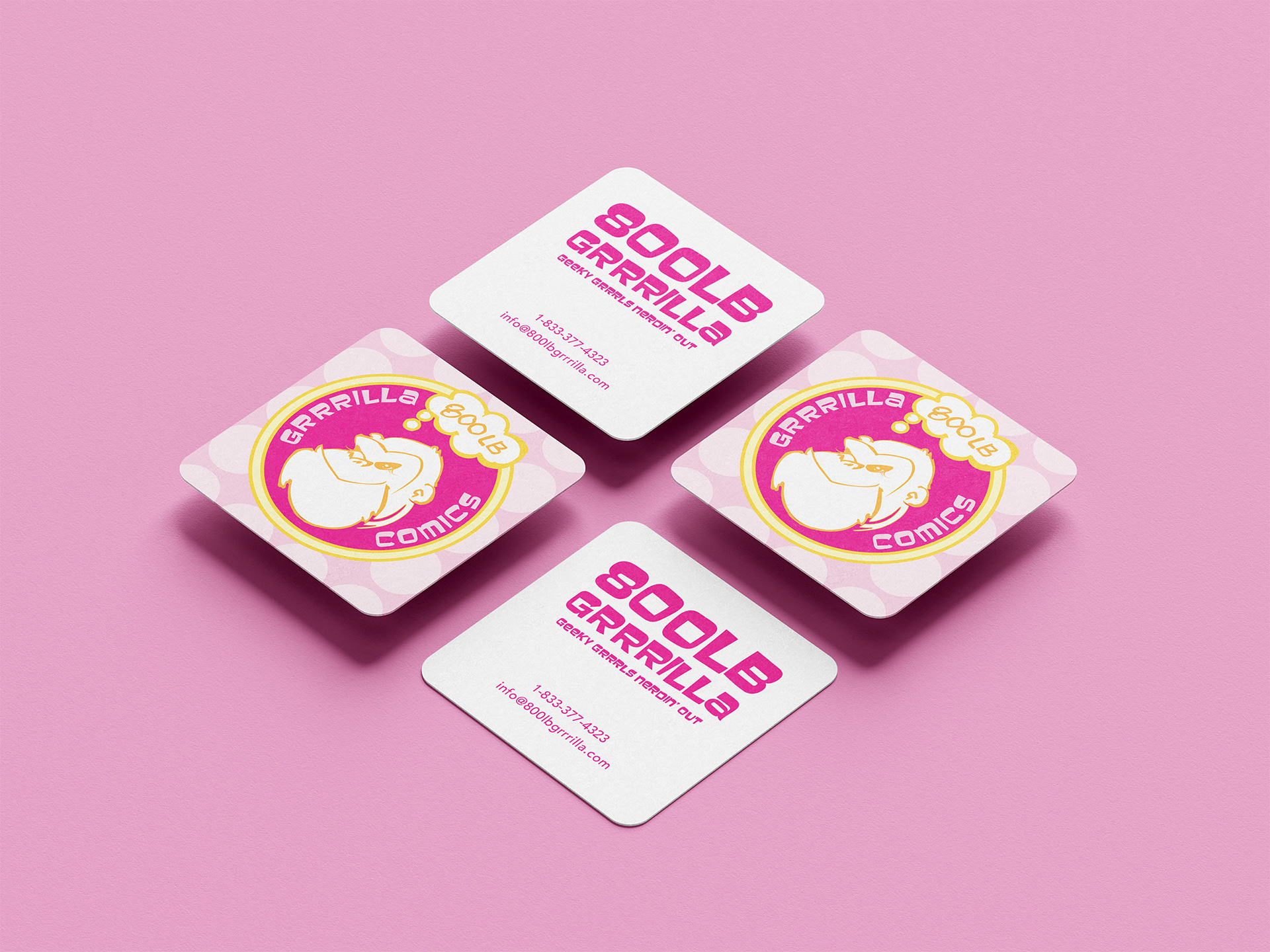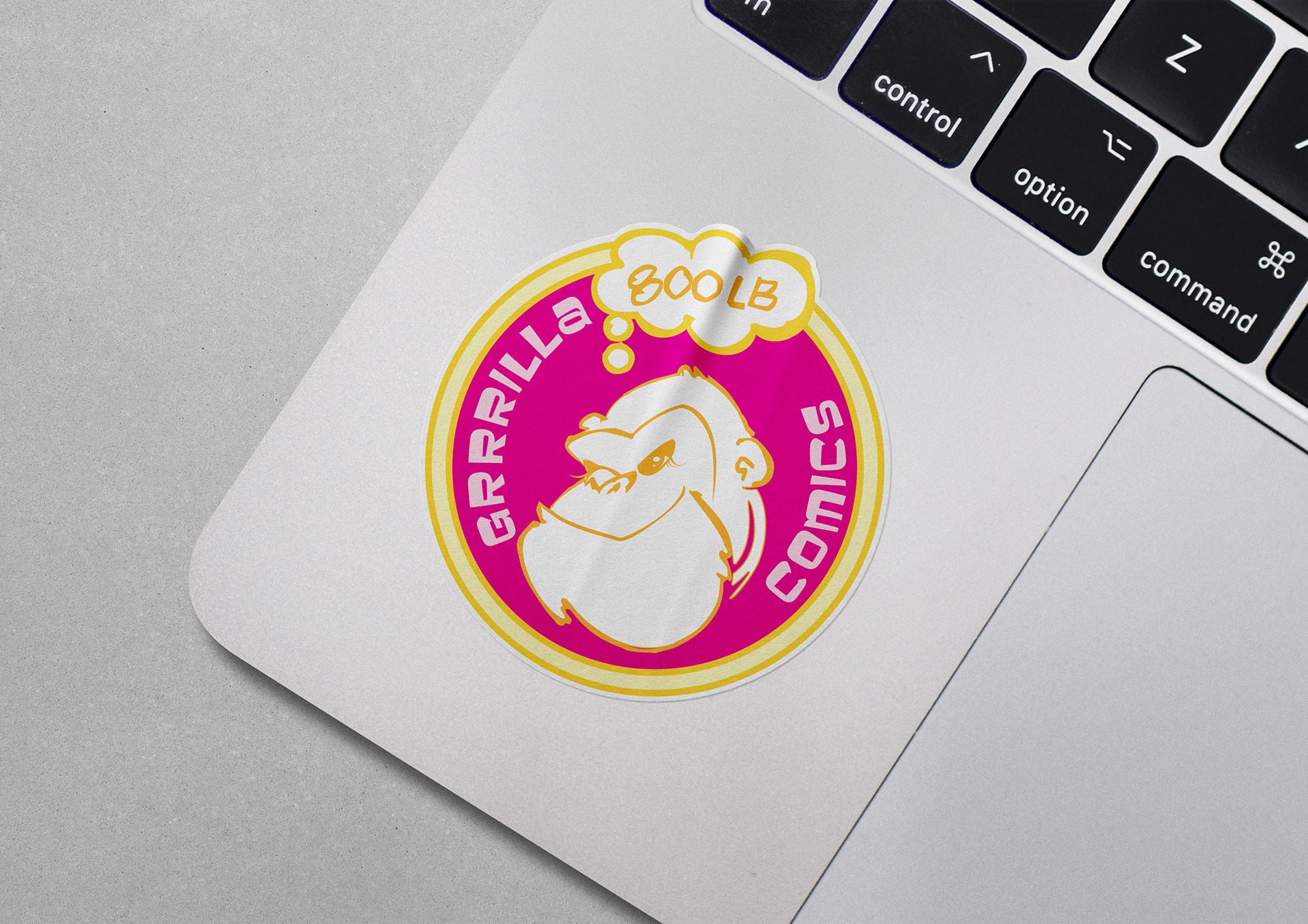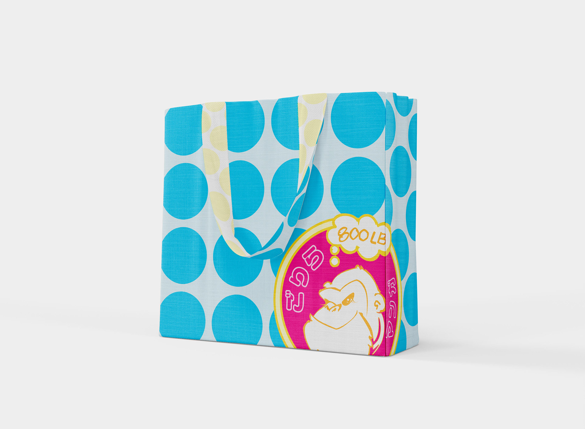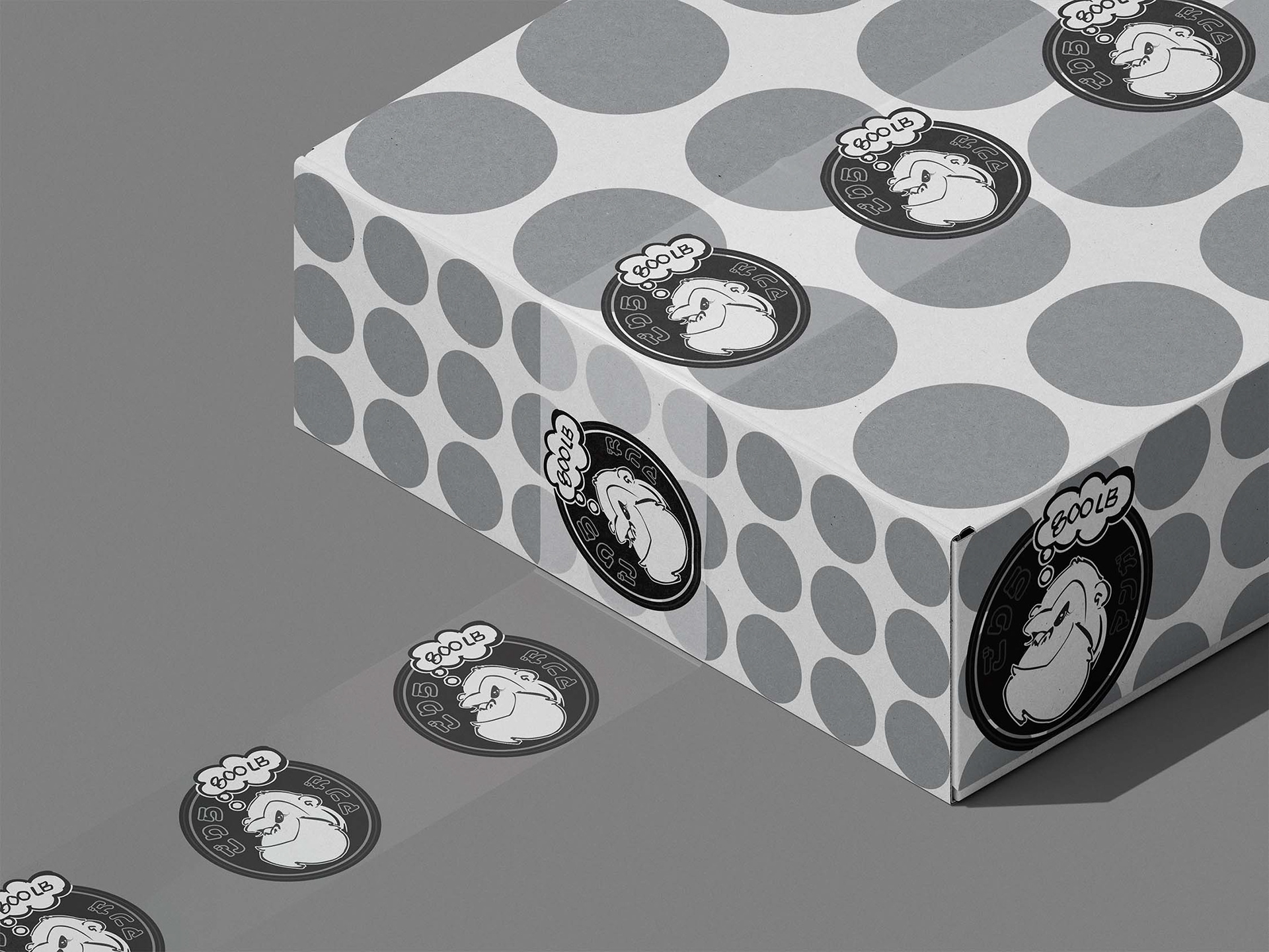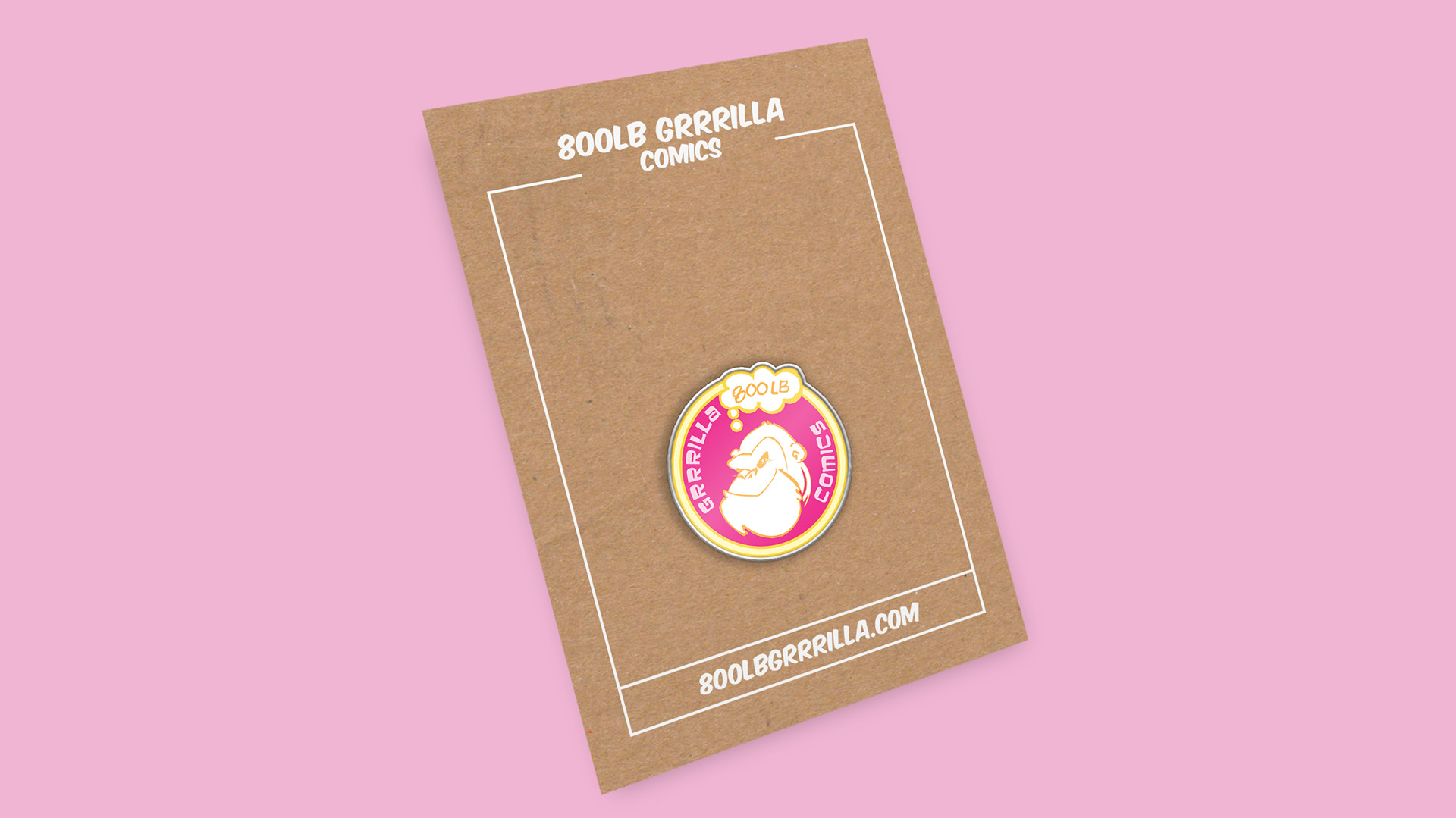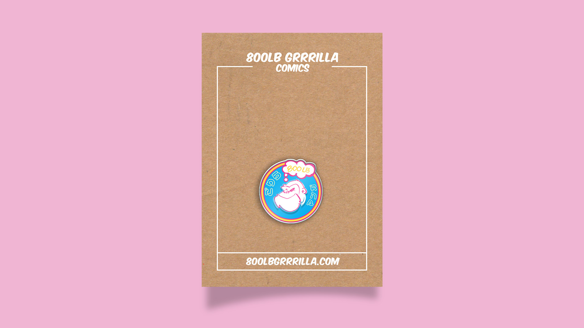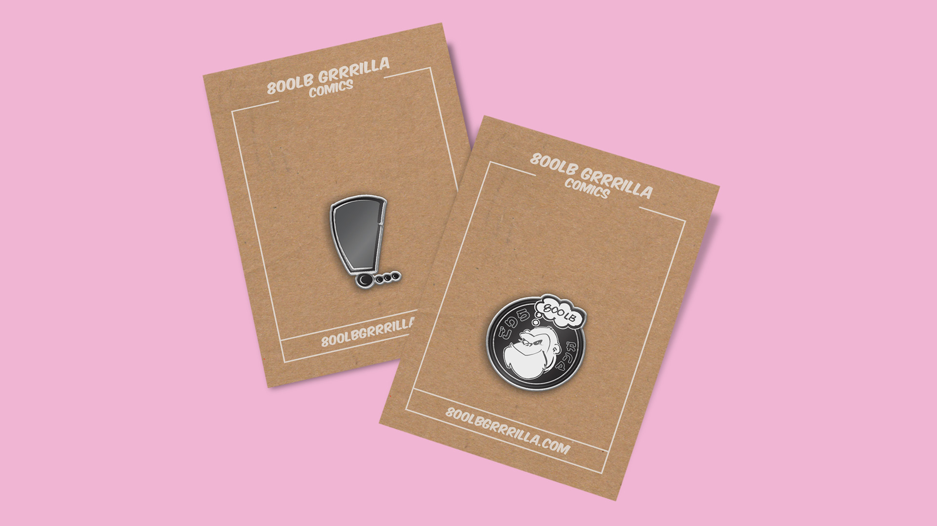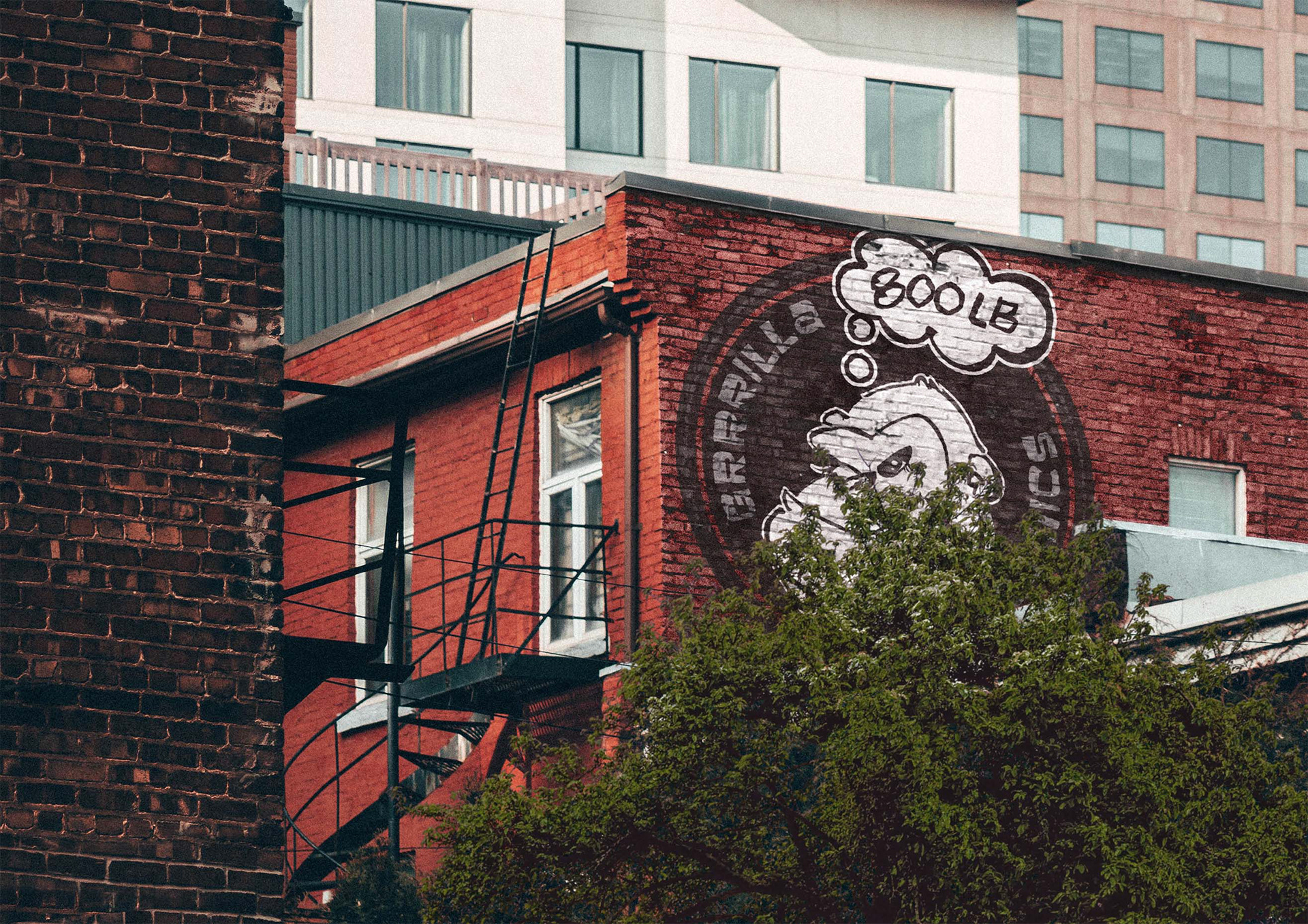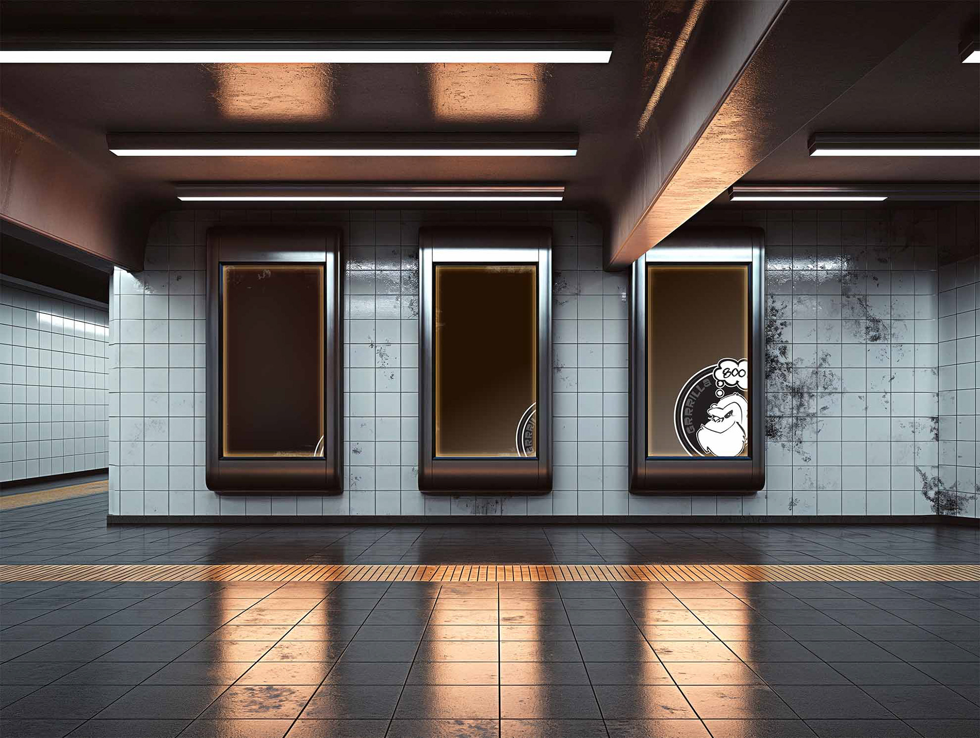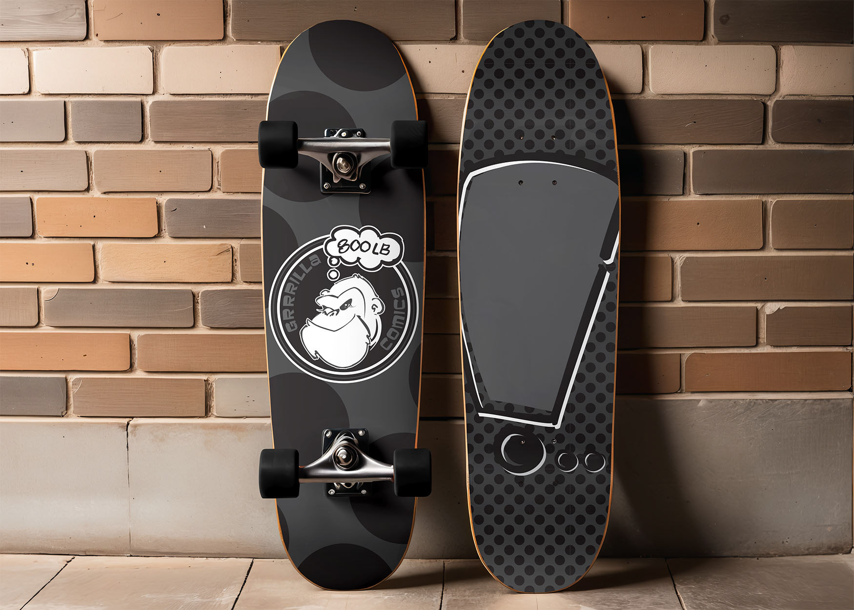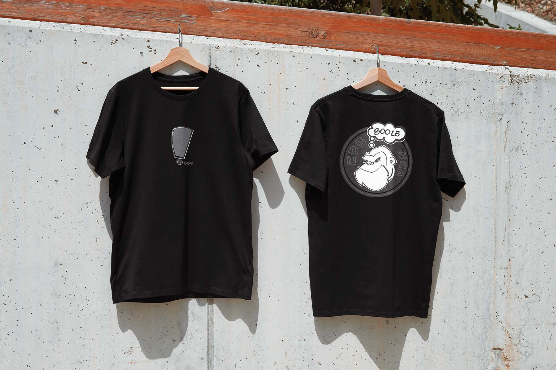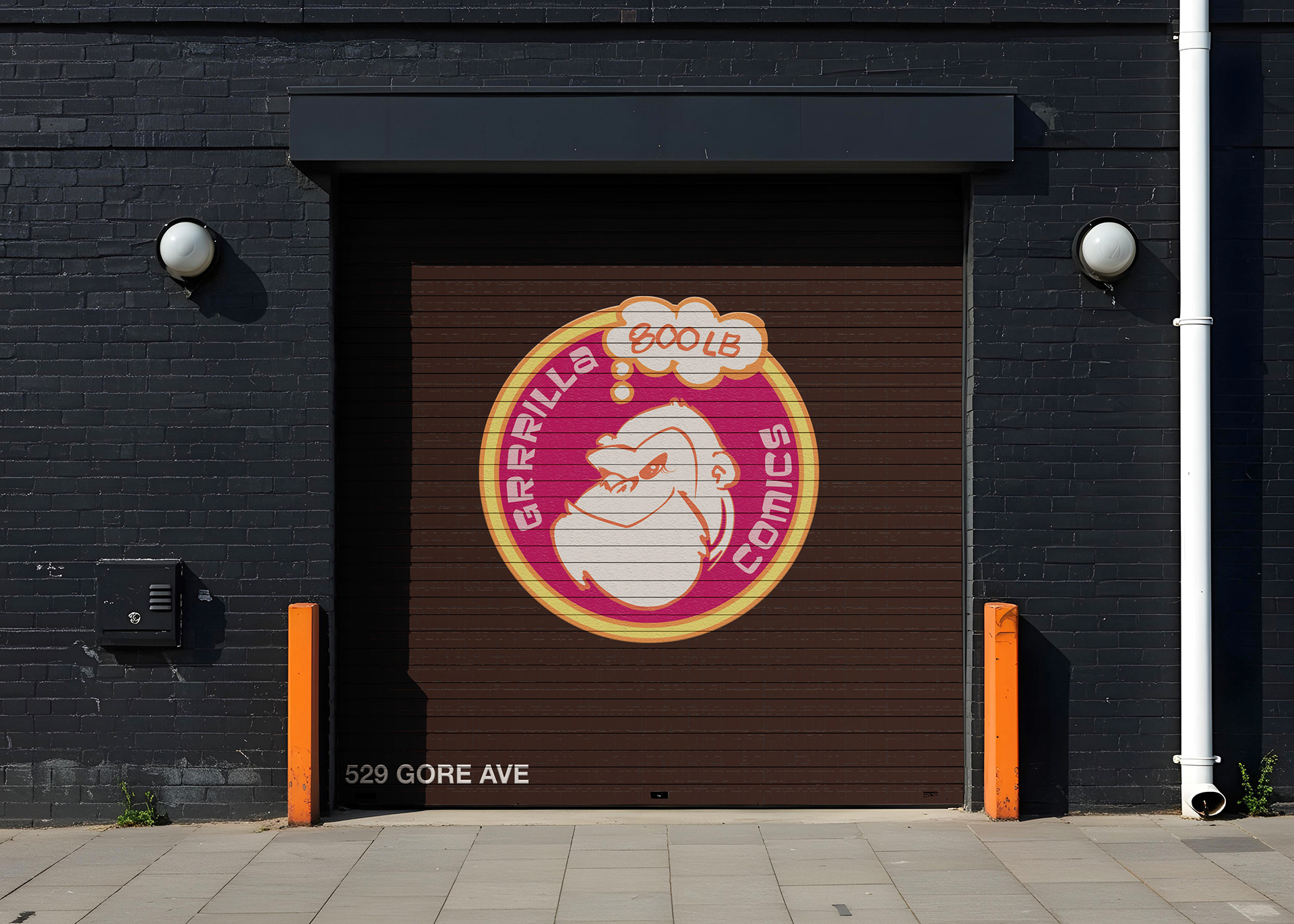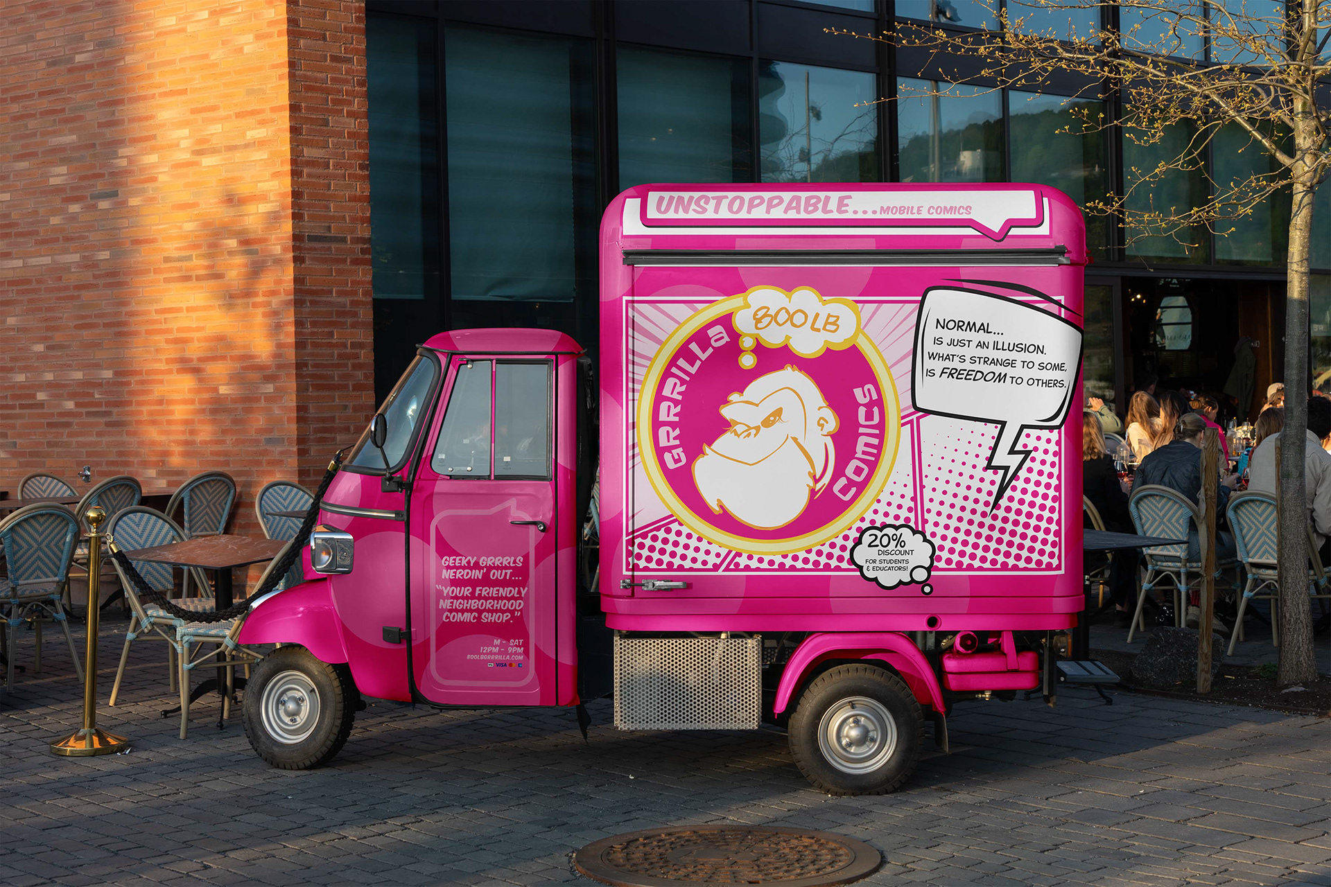
BRAND Identity: 800LB GRRRILLA COMICS
In business, gorillas are market leaders. A company whose market share and size allow it to set the terms for other companies in the same industry.

800LB GRRRILLA Comics is a shop that encourages women of all ages to let their geek flag fly. As more women owned businesses enter the industry, the creators chose a name that reflects the fact that this 800LB Gorilla can no longer be ignored. Inspired by the Riot Grrrl movement of the early 90's, the "triple R" replaces the traditional spelling of gorilla. A feminist movement designed to uplift women's voices, the repeating "r" suggests the growling ferocity of girl power at its most brash and unfiltered. Dedicated to celebrating "geeky grrrls", their mission is to inspire and support the next generation of young, geeky grrrl creators.


"A force to be reckoned with", is the message I wanted my client's logo to convey. It's color palette keeps it fun, feminine and loud, unable to be ignored. As a distributor of anime and manga, a Japanese version of the logo—with more vibrant colors—was included in the package as well. Typodermic Fonts' Baveuse was chosen for its quirky, goofy style reminiscent of the Sunday Comics of the 80's. By honoring the past while moving into the future their logo will remain timeless.