Concept Design: edible. Magazine
Brief: Design the prototype issue for inclusion in the media kit.
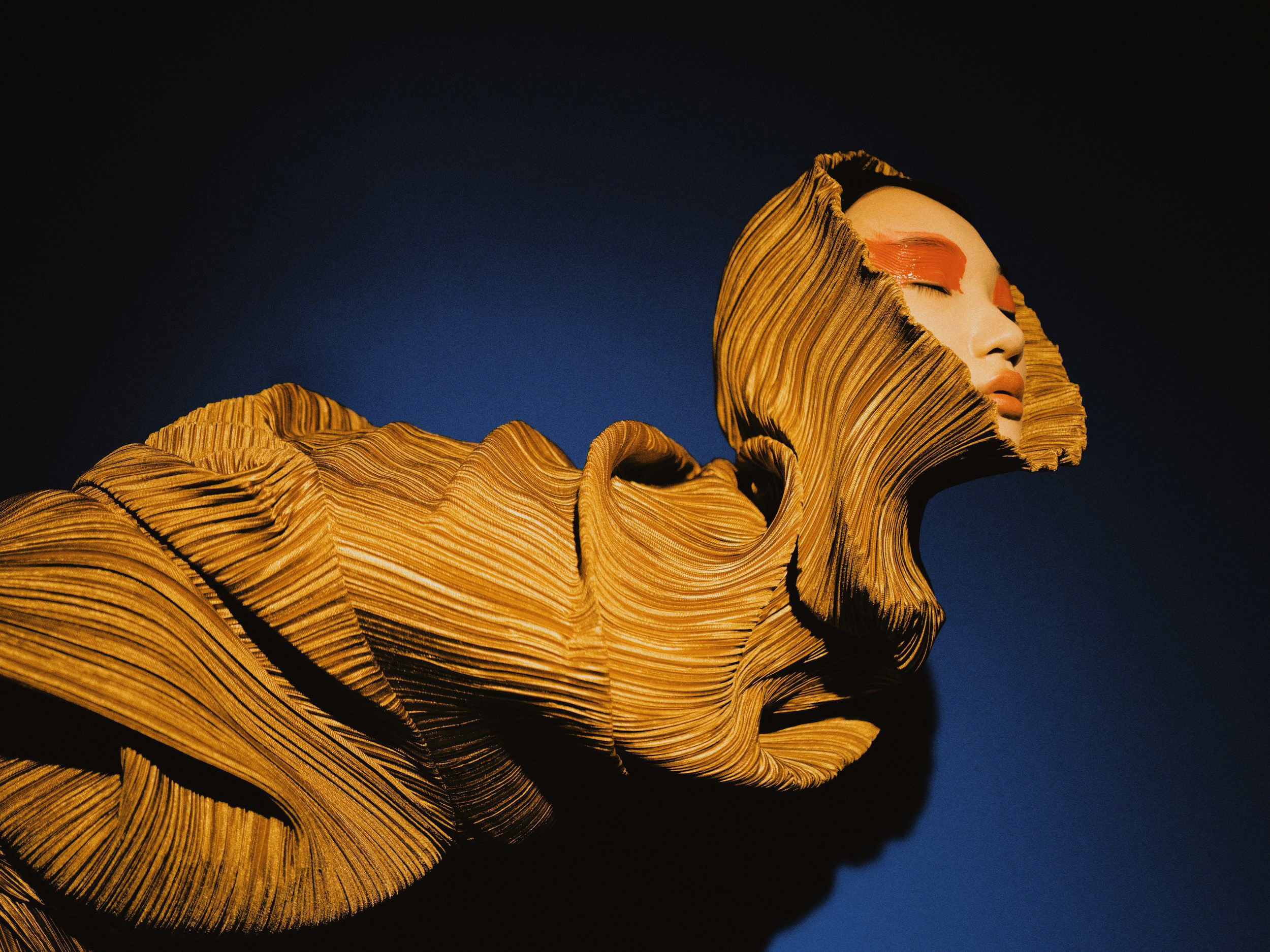
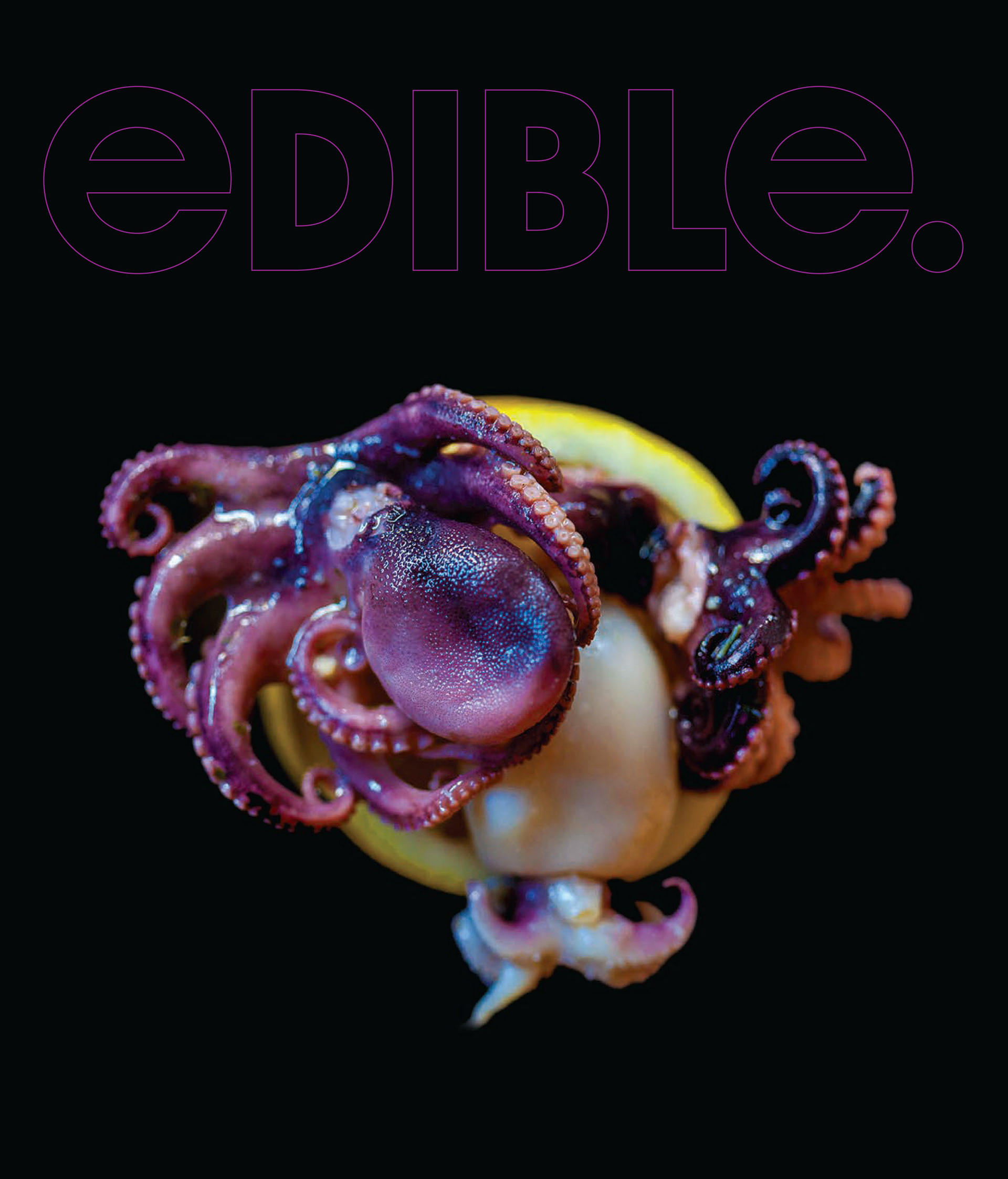
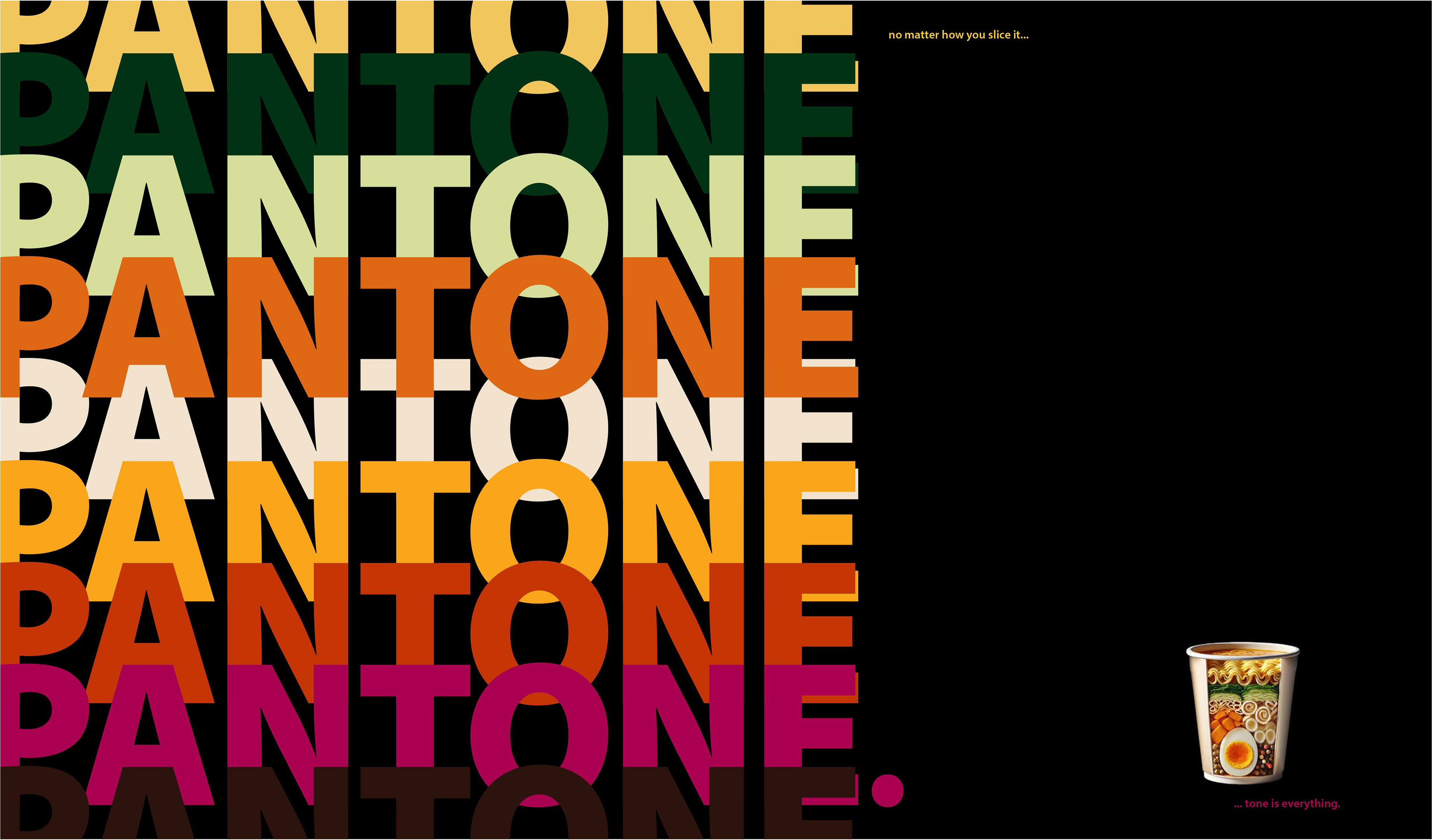
From cover to cover, the manipulation of food into an artistic expression remains the focus. Maintaining balance and harmony between the selected images and the typographic layout is key, so the utilization of the golden ratio led the design choices throughout the process, ensuring that every element of each spread contributed to telling of its individual story.
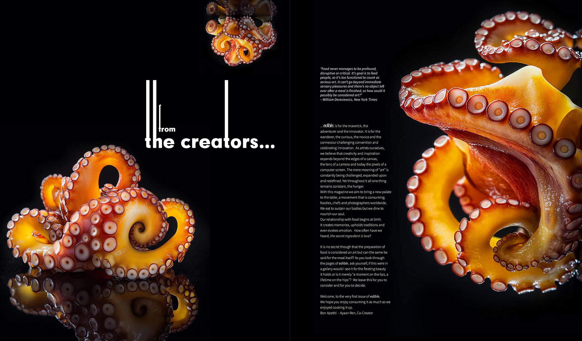
Radically niche, edible. features artists whom through; clever juxtapositions, meticulous styling and innovative techniques transform food from subject to medium. No longer merely a still life used to study shadow and light, food is elevated to a genuine objet d'art. edible.'s style is clean and non-traditional with no fluff. Purposeful, intentional and inspiring, these are the words that describe edible.