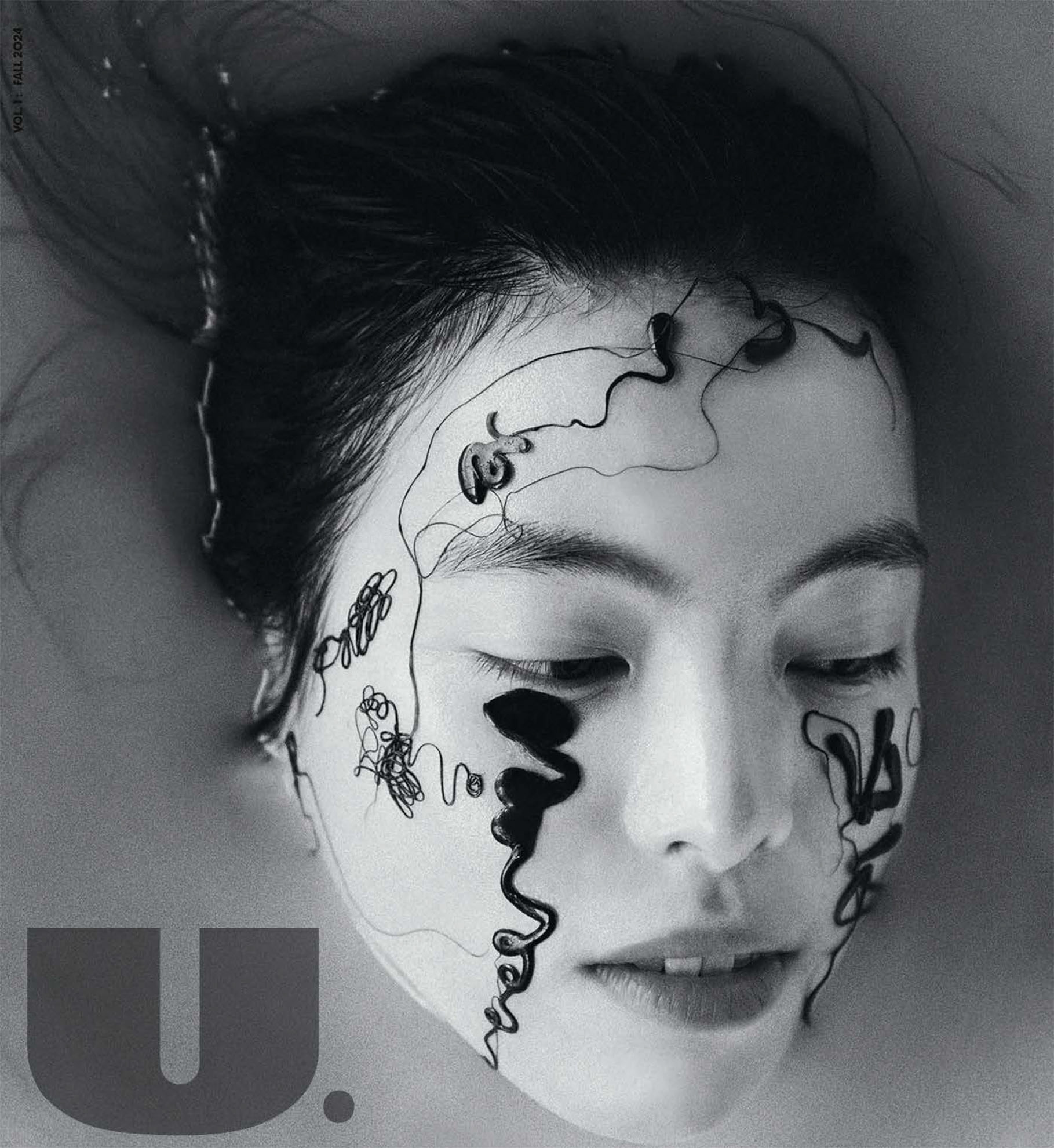
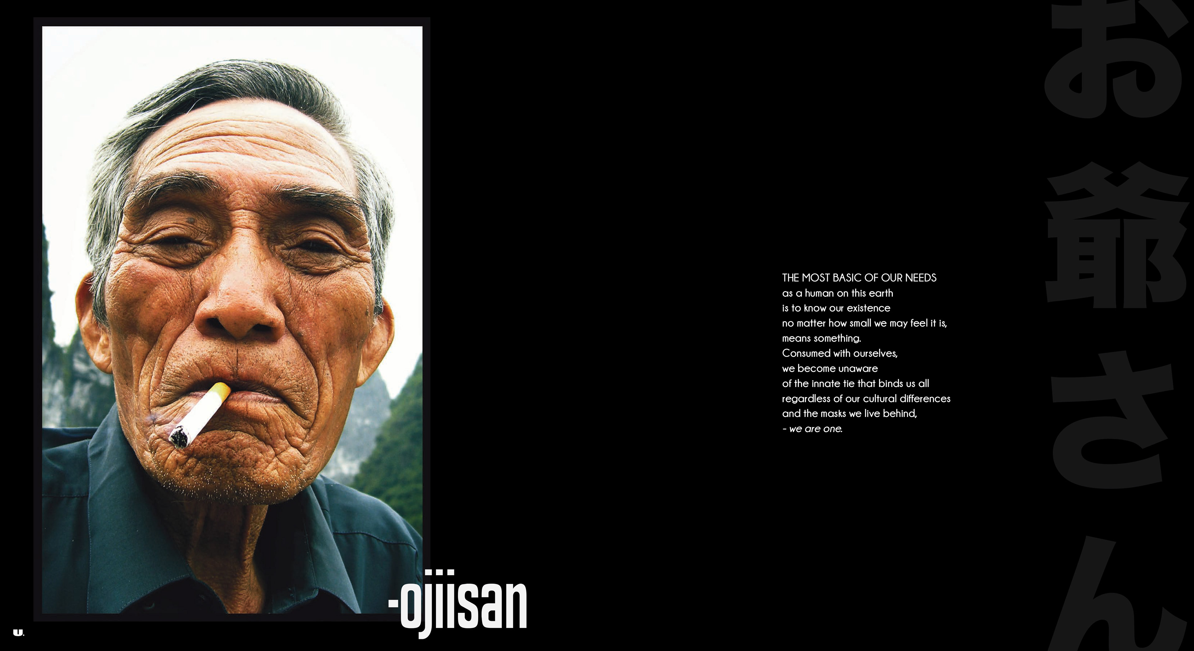
Concept Design: U. Magazine

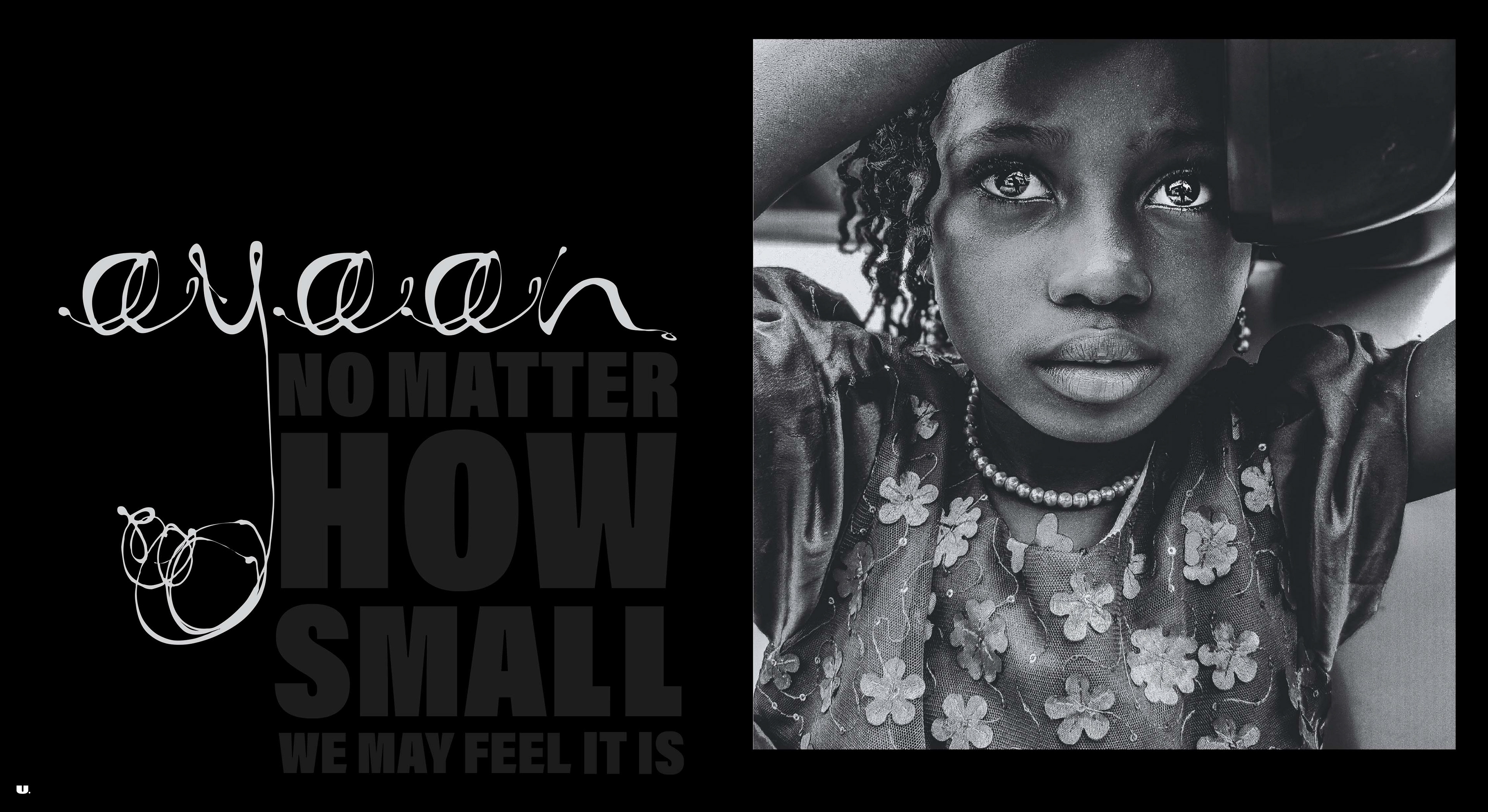
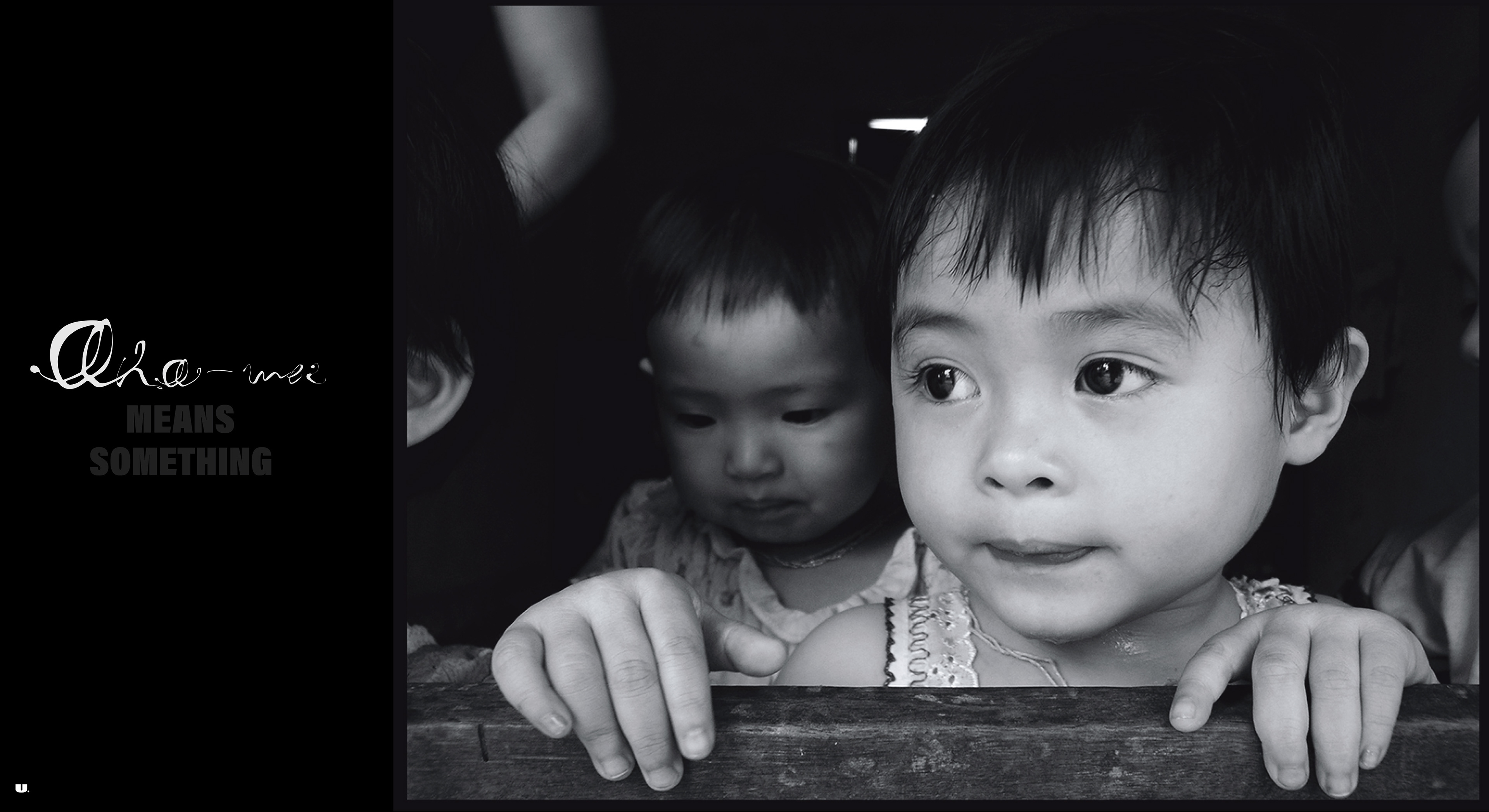
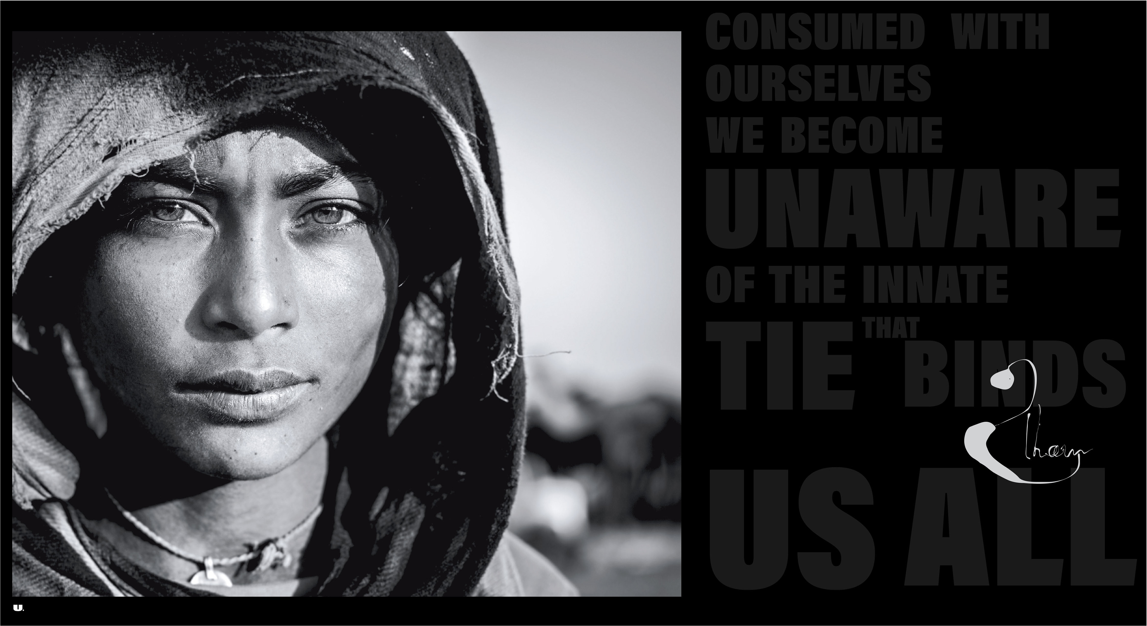
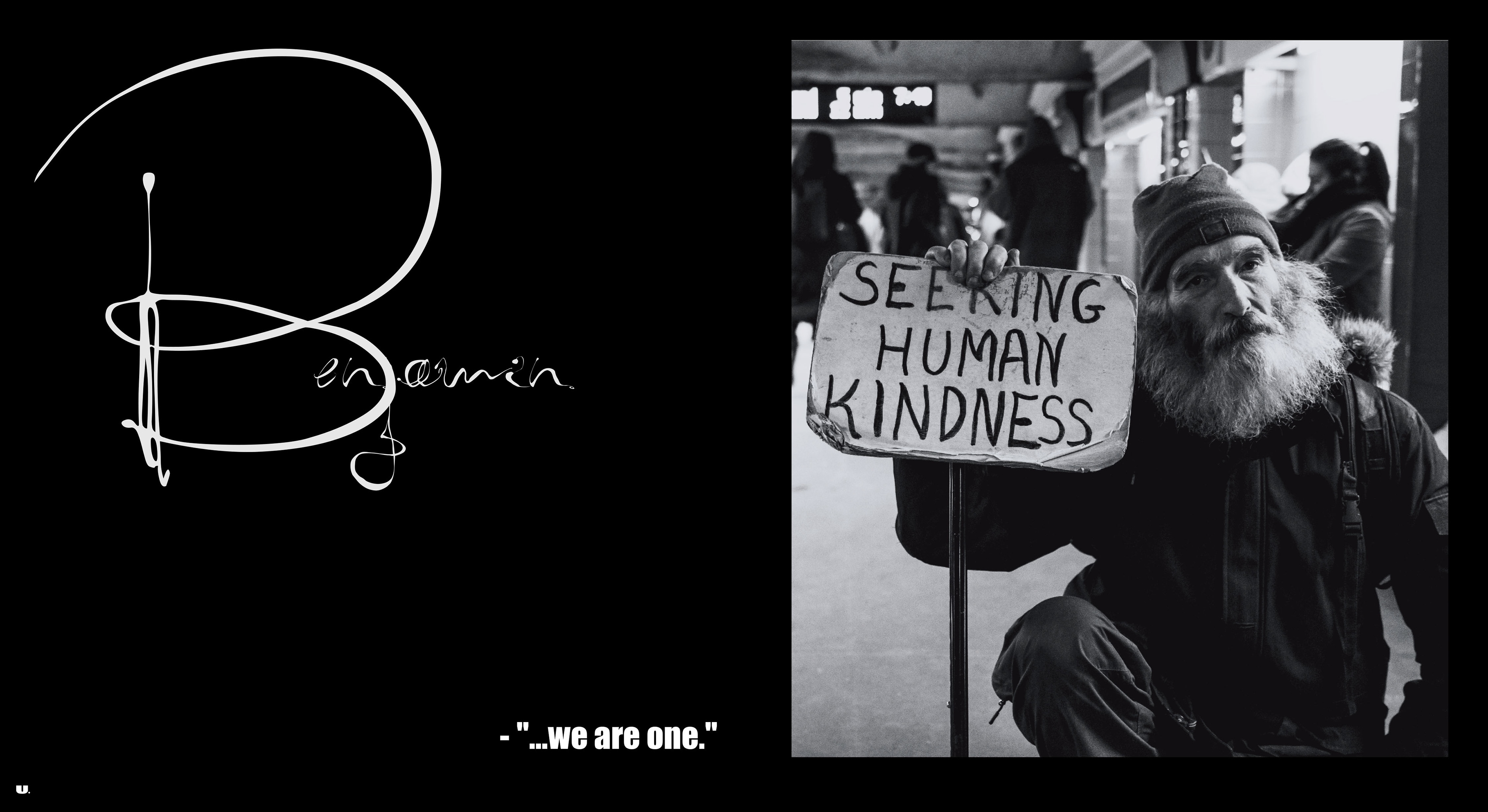
U. is the people’s magazine. The individuals featured are citizens of our global society; not celebrities, politicians or social icons. U. the single mom working and going back to school.   U. the 18yr old stacking apples at the local grocery store.  U. the violinist who serenades the evening sky, often only for a sincere accolade to fill your belly and U. the Sudanese girl in Darfur who prays that she will make it home safe.
Brief: Using the provided copy, illustrate our mission defining the publication's "why". Design a typographic layout in which the typeface(s) act as a supporting element while still remaining impactful.

Known for having a bold, commanding presence the typeface Impact was chosen for the masthead and the mission statement. Each line acts as a declarative statement subtly being made by its companion portrait. As the viewers first introduction to the individuals featured,  the typeface Kenyan Coffee is used for the table of contents.   The subtle elegance of its condensed design allows it to deliver great force in minimal space. Varying sizes and colors are used for the page numbers making each unique yet remaining connected by a common thread, its type family. Pulling from the artwork on the cover, the typeface Radio Frequency    is used for the signatures. Traditionally unique to the individual, this was done to further establish the brand's message that, "we are one". 
Masthead - Typeface : Impact
Table of Contents - Typeface : Kenyan Coffee
Brand Message - Typeface: Impact  
Portrait Signatures - Typeface: Radio Frequency
Body Copy and Credits - Typeface : Champagne & Limousines
Back to Top